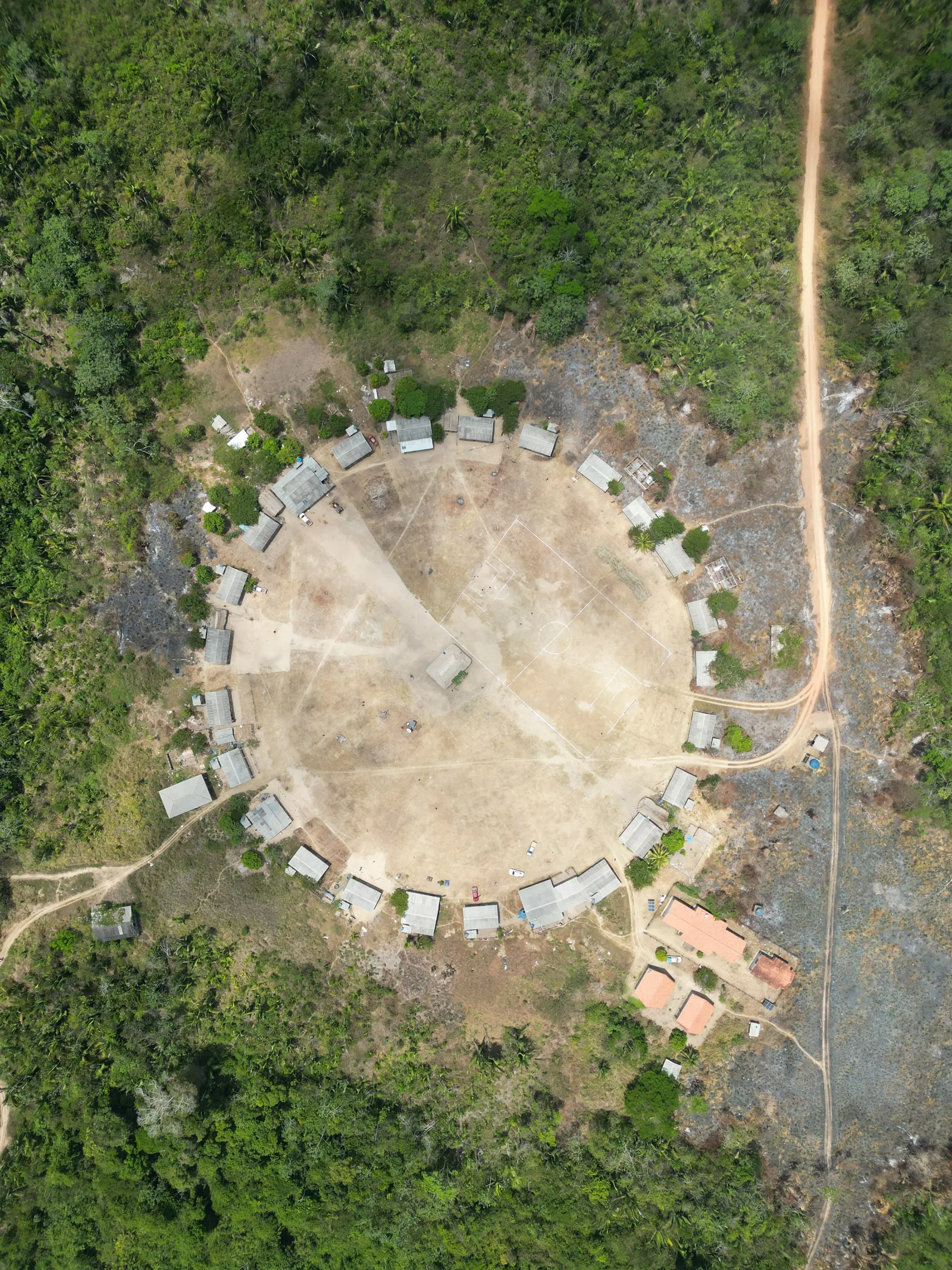
How to use the Berê Xikrin brand
Logo, colors, type, graphic patterns and images: the rules for speaking on the Association’s behalf the right way.
This is a summary of the rules for using the name, logo, colors, type, graphic patterns and photos of the Berê Xikrin Indigenous Association of the Bacajá Indigenous Territory. Anyone who wants to use the brand can download the logos and read the full guide through the links at the end of this page.
The brand, graphic patterns and images belong to the Mẽbêngôkre-Xikrin people. Use by third parties requires the Association’s prior permission.
Three principles
- It belongs to the people. Use by third parties only with the Association’s permission.
- Always the official file. The logo is never redrawn, cropped or recomposed.
- The Xikrin voice leads. No piece invents readings of the brand’s elements.
The logo
The signature joins the symbol (the seal with the arrows) and the BERÊ XIKRIN wordmark. Always use the ready-made file, in three formats: horizontal (the main one), vertical and symbol.
- Color: on a light background (white or palha). Preferred.
- Negative: horizontal only, on flat jenipapo.
- All white: on a darkened photo and the palette’s dark colors.
- All black: restricted: stamp, laser, one-color screen printing.
- Horizontal
- Vertical
- Symbol
Space and size
Leave a clear margin of 1x around the logo, the height of the letter E in “Berê”. For the symbol alone, 1/6 of its width.
Minimum size (width)
| Version | Digital | |
|---|---|---|
| Horizontal | 60 mm | 340 px |
| Vertical | 35 mm | 200 px |
| Symbol | 25 mm | 150 px |
| Wordmark alone | 20 mm | 100 px |
Colors
Urucum, jenipapo and palha carry the brand. Pequi, arara and floresta come in as an accent, one per piece. Pequi only on jenipapo. All approved text pairings pass AA contrast (4.5:1).
- Urucum
#C8201A - Jenipapo
#15110E - Palha
#F7EFE3 - Pequi
#F6B800 - Arara
#1F3A93 - Floresta
#0B6E3F
Typography
Mẽbêngôkre
Unbounded for headings and Be Vietnam Pro for text. Both carry the “ẽ” of Mẽbêngôkre. A font without that sign breaks the people’s name. Without the fonts installed, use Arial.
Graphic patterns
Zigzag, squares, V stripes and band come from the logo itself. They are dividers, markers or watermarks, never a solid fill behind text, at 7% opacity at most. Xikrin body-painting patterns only come in with permission, with names and meanings written by the community.
Images
Real photos, with credit, alt text and a signed image-use release. No AI-generated images, no “exotic Amazon” clichés, no photos of children or rituals without collective permission, and no crafts of other peoples presented as Xikrin.
Name and voice
First mention: Berê Xikrin Indigenous Association of the Bacajá Indigenous Territory. Afterwards: Berê Xikrin, Berê or the Association. Always write Mẽbêngôkre with “ẽ” and “ê”. Say Indigenous people, not “Indians” or “tribe”, and never treat the culture as past.
What never to do
- Distort, stretch or slant
- Recolor, invert or apply filters
- Add shadow, glow or outline
- Rotate the signature
- Swap the letters for a font
- Split or recompose symbol and wordmark
- Use parts as a logo, like the zigzag of the R
- Frame it in boxes or seals
Going to use the brand?
Download the official files, read the full guide and ask the Association to approve before publishing.
Logos
Official files as PNG with transparent background: color, negative, all white, all black and social profile picture.
Open logo folderopens in Google DriveBrand guidelines
The full guide, as a PDF, with 20 pages of rules, examples and a checklist.
Open the guideopens in Google Drive
Permission and questions: xikrinbere@gmail.com